Guides
Wall Colour Psychology: Choose Colours by Mood
July 11, 2026 · 9 min read
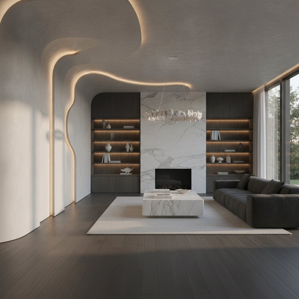
Wall colour psychology is how colour affects mood in a room. Broadly, warm colours (reds, oranges, yellows) energise and cosy up a space, while cool colours (blues, greens, purples) calm and relax it. The best wall colour depends on the room's purpose and the light it gets, not fashion alone.
What is wall colour psychology?
Colour psychology is the study of how hues influence perception, mood and behaviour. In interiors it is not mysticism — it is a practical design tool. Colour changes how big a room feels, how warm or cool it seems, how calm or lively it is, and how the light behaves. Because walls are the largest coloured surface in most rooms, wall colour sets the emotional baseline everything else sits against.
Two caveats keep this honest. First, colour associations are general and partly cultural, not laws — personal memory and context matter. Second, saturation and lightness change everything: a soft dusty blue and an electric cobalt are the same hue doing completely different jobs. Use the associations below as a starting direction, then adjust for how strong the colour is and how the room is used.
Warm vs cool: the single most useful distinction
The most useful split in colour theory is warm versus cool. Warm colours — reds, oranges, yellows and warm neutrals — advance toward you, making a large or cold room feel cosier and more sociable, which is why they suit living and dining spaces. Cool colours — blues, greens and purples — recede, making a space feel calmer, more open and more restful, which is why they suit bedrooms and bathrooms.
Temperature also affects perceived size and light. Cool, light colours visually push walls back and are a classic trick for making small or dark rooms feel larger and airier. Warm, deep colours draw walls in and make a cavernous or under-used room feel intimate and grounded. Match the temperature to both the mood you want and the problem you are solving.
- Warm hues — energising, cosy, sociable; good for living, dining and social spaces.
- Cool hues — calming, restful, spacious-feeling; good for bedrooms, bathrooms and studies.
- Light values — open a room up and reflect light; help small or dark spaces.
- Deep values — enclose and dramatise; make large or bright rooms feel intimate.
- Neutrals — flexible backdrops that take their warmth or coolness from their undertone.
How does room light change a colour?
A colour is only as good as the light it lives in. The same paint can look fresh and bright in one room and cold and grey in another purely because of orientation and light quality. North-facing rooms get cool, flat light that can turn cool colours dreary — they usually flatter warmer or richer tones. South-facing rooms get warm, generous light that lets cool colours sing and can make warm colours feel intense.
Artificial light matters just as much: warm bulbs (around 2700K) push colours toward yellow and amber; cooler bulbs push them toward blue. This is why you should always judge a colour at the times of day you use the room, under the bulbs you actually own. For the full picture of colour temperature and layering, see best lighting for every room.
A reference list: colours and the feelings they evoke
Here is a practical reference to the widely recognised associations of common wall colours. Treat these as general starting points, then adjust the saturation and lightness for your room:
- Blue — calm, restful, trustworthy and clean; lowers the visual temperature. Best for bedrooms, bathrooms and studies.
- Green — balanced, natural and restorative; bridges warm and cool and is easy on the eye. Works almost anywhere, especially living rooms and kitchens.
- Yellow — cheerful, warm and energising in small doses; can feel harsh if too strong or acidic. Good for kitchens, hallways and dark rooms that need lifting.
- Red — stimulating, passionate and appetising; raises energy and intimacy. Best as an accent or in social and dining spaces, rarely a whole bedroom.
- Orange and terracotta — sociable, warm and grounding; friendlier and easier to live with than red. Good for living, dining and social spaces.
- Pink (soft or blush) — gentle, warm and flattering to skin tones; calming rather than girlish in muted shades. Good for bedrooms and living rooms.
- Purple and lavender — soft lilacs soothe like cool colours; deep plums feel luxurious and dramatic. Bedrooms and feature walls.
- Grey — neutral, sophisticated and calm; can feel cold if the undertone is too blue and the room lacks warm light. A flexible backdrop everywhere.
- Beige, greige and taupe — warm, comforting, understated neutrals that flatter almost any scheme. Universal backdrops.
- White and off-white — clean, spacious and light-maximising; choose a warm white to avoid a clinical feel. Great for small and dark rooms.
- Black and charcoal — dramatic, grounding and elegant in the right space; best in small doses or well-lit rooms as contrast.
- Brown and earth tones — stable, secure and natural; warm and grounding, especially alongside wood and texture.
Best wall colours room by room
Purpose should lead colour. Ask what you do in the room and how you want to feel there, then choose a temperature and depth to match:
- Bedroom — favour calm, restful tones: soft blues, greens, warm neutrals, muted lavender or blush. Save high-energy colours for accents. See small bedroom makeover for tight spaces.
- Living room — warm, sociable and welcoming: earthy neutrals, warm greys, greens and terracotta accents. More in living room design ideas.
- Kitchen — clean and appetising: whites, warm neutrals, sage or blue-green cabinetry, cheerful accents. See modern kitchen remodeling.
- Bathroom — fresh and spa-like: soft blues, greens, off-whites and warm stone tones.
- Home office — focused but not sterile: greens and soft blues aid concentration; add a warm accent to avoid coldness.
- Hallway — welcoming and often light-starved: warm, light tones lift a dark entry; deeper tones can add drama where there is enough light.
How to use the 60-30-10 rule
A reliable way to combine colours without a design degree is the 60-30-10 rule: about 60% of the room a dominant colour (usually walls and large areas), 30% a secondary colour (upholstery, curtains, a feature wall), and 10% an accent (cushions, art, accessories). It gives balance and a clear hierarchy while leaving room for personality in that final 10%.
The safest schemes keep the 60% relatively neutral and let the smaller percentages carry the colour, because accents are cheap and easy to change when your taste moves on. This is also where an accent wall can go wrong — it only works when the colour relates to the rest of the palette, one of the common design mistakes worth avoiding.
Common colour mistakes to avoid
- Choosing colour from a tiny chip in the shop instead of a large sample on your own wall.
- Ignoring the room's light and orientation — the biggest cause of disappointing results.
- Using too many strong colours at once; let one colour lead.
- Forgetting undertones — a grey with a blue undertone reads very differently from a warm greige.
- Painting a small dark room a dark colour to 'make it cosy' when it just makes it gloomy.
- Matching wall colour to a trend rather than to how you want the room to feel.
Test before you commit
Colour is the cheapest thing to change and the easiest to get wrong, so test before you commit. Traditionally that meant painting patches and living with them for a few days. Faster: preview colours on a photo of your actual room with AI, so you judge the shade in your space, your light and against your furniture.
Upload a photo to Decorly, try several palettes, and compare them side by side in about seconds each — then buy the paint you have already seen on your own walls. For the styles these palettes belong to, browse interior styles.
Frequently asked questions
What is wall colour psychology?
It is how wall colour affects mood and perception in a room. Warm colours energise and cosy up a space; cool colours calm and open it. The right choice depends on the room's use and light.
What colour is best for a bedroom?
Restful, cool or muted tones — soft blue, green, warm neutral or muted lavender — suit bedrooms because they lower visual energy and aid relaxation. Keep bold, stimulating colours to accents.
Do colours really affect mood?
Colour reliably influences how a space feels — warm versus cool, calm versus lively, large versus intimate. The associations are general and partly cultural rather than absolute, so use them as a guide alongside your own taste and the room's light.
Why does my paint look different at home?
Light. A colour shifts with a room's orientation and with warm or cool bulbs. Always test a large sample in the actual room, at the times of day you use it.
What is the 60-30-10 rule?
A simple balancing formula: about 60% dominant colour, 30% secondary and 10% accent. It gives a scheme hierarchy and balance while keeping the colourful accents cheap and easy to change.