Guides
Common Interior Design Mistakes and How to Fix Them
July 11, 2026 · 8 min read
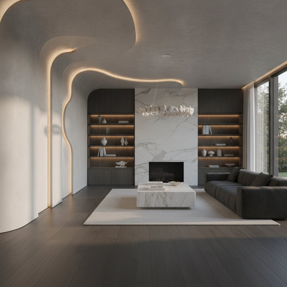
The most common interior design mistakes are using an undersized rug, relying on a single overhead light, ignoring scale and proportion, chasing too many trends at once, pushing all the furniture against the walls, and choosing wall colour before testing it. Each one has a simple, low-cost fix.
What are the most common interior design mistakes?
Most design problems are not about taste or budget, they are a handful of predictable errors that even expensive rooms make. The good news is that each one has a clear, usually cheap fix, and correcting them is what separates a room that feels off from one that feels resolved.
Notice that none of these is about money. You can make every one of them in an expensive room and avoid all of them in a cheap one, because good design is mostly about relationships, between the rug and the furniture, the light and the space, the trend and the base, rather than the price of any single piece. The six below account for the great majority of rooms that feel not quite right.
- An undersized rug that floats in the middle of the room.
- One harsh overhead light instead of layered lighting.
- Furniture and art at the wrong scale for the space.
- Too many trends competing in a single room.
- Everything pushed flat against the walls.
- Wall colour chosen from a tiny chip without testing.
Mistake 1: The rug is too small
An undersized rug is the most common, and most jarring, mistake in any room. A small rug marooned in the centre makes the whole space feel smaller and disjointed, like a stamp on an envelope.
The fix: go bigger than feels natural. As a rule, the front legs of all the main seating should sit on the rug, tying the arrangement together. In a dining room, the rug should extend far enough that chairs stay on it even when pulled out.
- Living room: at minimum, the front legs of every sofa and chair on the rug.
- Bedroom: a large rug under the lower two-thirds of the bed, framing it on three sides.
- Dining room: at least 60 to 75cm of rug beyond the table edge on every side.
Mistake 2: Relying on a single overhead light
One central ceiling light casts flat, unflattering light and leaves the edges of a room in gloom. It is the fastest way to make a space feel cold and institutional, no matter how nice the furniture.
The fix is layered lighting: combine ambient, task and accent sources at different heights so light comes from several points, not one. Add lamps, use warm-white bulbs and put a light in every dark corner. Our lighting guide covers each room in detail.
- Aim for at least three light sources in a living space.
- Use warm-white bulbs (around 2700K) in relaxing rooms.
- Add dimmers so one room can flex from bright to intimate.
- Light the corners, even all-over light is what makes a room feel finished.
Mistake 3: Ignoring scale and proportion
Scale is the quiet reason a room feels wrong even when every piece is nice on its own. A tiny sofa in a large room looks lost; an oversized sectional in a small room feels crammed. Proportion is about how pieces relate to the room and to each other.
A quick sanity check: if a piece makes you instinctively walk around it, it is probably too big; if it disappears against the wall, it is too small. Trust that reaction, scale is felt before it is measured, and your eye is a better judge than any tape.
- Match furniture to the room's size, one generous piece beats several undersized ones.
- Hang art at eye level, with its centre about 145 to 150cm from the floor.
- Size artwork to the wall or furniture below it, roughly two-thirds the width of the sofa.
- Vary height, mix tall and low pieces so the eye moves around the room.
Mistake 4: Chasing too many trends at once
Trends are tempting, but a room stuffed with this year's colours, shapes and materials dates fast and feels incoherent. The rooms that age well use a calm, timeless base and treat trends as accents.
A helpful test is to ask whether you will still like a choice in five years. If the answer is no, it belongs in a cushion, a print or a coat of paint you can change cheaply, not in a sofa or a floor you will live with for a decade.
- Keep big-ticket, hard-to-change items (sofa, flooring, cabinetry) neutral and classic.
- Express trends through cheap, swappable things, cushions, art and accessories.
- Limit yourself to one or two statement ideas per room, not five.
- Choose a coherent style, Japandi, modern or minimalist, and let it guide decisions.
Mistake 5: Pushing all the furniture against the walls
Lining every piece of furniture against the walls is instinctive, but it usually makes a room feel emptier and more awkward, with a dead zone in the middle and no sense of intimacy.
The fix is to arrange for conversation and flow. Pull seating a little off the walls, group it around a focal point, and leave clear walkways around the edges. A room should feel like it has zones, not a running track around a void.
- Float the sofa to create a defined seating area.
- Angle chairs toward each other so people can actually talk.
- Anchor the layout on a focal point, a window, fireplace or the main view.
- Keep a comfortable walkway (around 75 to 90cm) through the main routes.
Mistake 6: Choosing wall colour without testing it
Picking paint from a thumbnail chip is how people end up with a colour they dislike on every wall. Colour changes dramatically with a room's light, its size and the surfaces around it, so a swatch in the shop tells you almost nothing.
- Paint large test patches on more than one wall, not tiny dabs.
- View the colour in morning, afternoon and evening light before deciding.
- Consider the room's aspect, warm tones flatter cool, north-facing rooms.
- Look at the colour next to your flooring and furniture, not in isolation.
How do you avoid interior design mistakes before you start?
Almost every mistake on this list is expensive to fix after the fact and nearly free to avoid beforehand, if you can see the result first. That is the real value of visualising a room before you commit.
- Size the rug to the furniture, not the floor gap.
- Plan at least three layers of light, not one ceiling fixture.
- Check every large piece against the room's scale.
- Keep the base neutral and add trends as cheap accents.
- Arrange furniture for conversation and clear flow, as in the furniture placement guide.
- Test paint on the wall, in real light, before buying.
Can AI help you catch design mistakes?
Yes, because seeing a change before you make it is what prevents most of these errors. Upload a photo to Decorly, try your palette and layout, and catch problems on screen in seconds rather than in your finished living room or bedroom.
It is a low-risk way to test scale, colour and arrangement together. For the full method of getting a room right from the start, read the complete room transformation guide.
Frequently asked questions
What is the most common interior design mistake?
Using a rug that is too small. A rug should sit under at least the front legs of the main seating; a small rug floating in the centre makes the whole room feel disjointed and smaller.
How do I fix a room that feels off but I cannot say why?
Check scale and lighting first. A room usually feels wrong because pieces are the wrong size for the space or because a single harsh overhead light is flattening it. Both are cheap to correct.
Should furniture go against the walls?
Usually not. Pulling seating slightly off the walls and grouping it around a focal point makes a room feel more intimate and intentional than lining everything against the perimeter.
Why does my paint colour look wrong on the wall?
Colour shifts with light, room size and nearby surfaces. Always test large patches on more than one wall and view them in morning, afternoon and evening light before committing.
How high should I hang artwork?
At eye level, with the centre of the piece roughly 145 to 150cm from the floor. Over furniture, size the art to about two-thirds the width of the piece below it.