Outdoor
AI Exterior Home Design & Kerb Appeal
July 11, 2026 · 8 min read
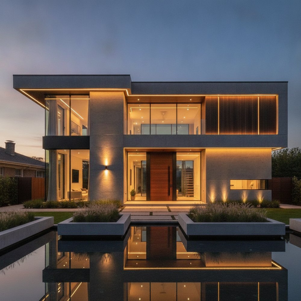
AI exterior design lets you redesign your home's façade from a single photo — testing render colours, cladding, front doors, roof and trim combinations and landscaping in about seconds while keeping the real building shape, windows and rooflines intact. It turns kerb-appeal guesswork into a fast, low-risk before-and-after preview.
What is AI exterior design?
AI exterior design uses generative image models to redraw the outside of a building from a photo. You upload a shot of the front elevation, choose a direction — say a warm modern farmhouse or a crisp contemporary look — and the AI returns a photorealistic version of your actual house with new colours, materials and planting, not a generic stock image.
The point is context. A good tool keeps your rooflines, window positions, porch and proportions fixed, so what you see is a believable redesign of your home rather than a different house entirely. That makes it genuinely useful for planning, because you are judging changes against the building you actually own. You can preview exterior ideas before you spend a rupee on paint, render or a landscaper.
What actually creates kerb appeal?
Kerb appeal is the first impression your home makes from the street. It is rarely one big feature — it is the sum of several small things reading as a coherent whole: a balanced façade, a considered colour palette, a welcoming entrance, tidy landscaping and clean, well-maintained details.
Designers think in terms of hierarchy. The eye should land on the front door first, then travel along clean horizontal and vertical lines, and never snag on clutter. Before you change anything, walk to the far side of the street and look at your home the way a visitor or a buyer does.
- Symmetry and balance — do the elements feel evenly weighted either side of the entrance?
- A clear focal point, usually the front door.
- A restrained palette: one main colour, one trim, one accent.
- Framing greenery that softens hard edges without hiding the house.
- Clean, maintained details — gutters, paint, paving and pointing.
- Concealed clutter: bins, meters and cables tucked out of the sightline.
How do you choose a façade colour?
Exterior colour follows the same theory as interiors, just at a bigger scale and under changing daylight. Work with three roles: a dominant colour for the main walls or render, a secondary colour for trim, fascias and window frames, and an accent for the front door. A common, safe split is roughly 60% dominant, 30% secondary and 10% accent.
Cooler, muted tones — soft greys, greige, sage and off-whites — read as calm and contemporary and tend to age gracefully. Warmer earthy tones — clay, stone, warm white and terracotta — feel traditional and inviting. Whatever you choose, test it against the fixed elements you are not changing: the roof colour, brick, stone and paving all carry undertones you must harmonise with.
Sample big and look across the day. Exterior colours shift dramatically between flat morning light, harsh midday sun and warm evening light, and a shade that looks perfect on a chip can turn cold or muddy on a whole wall. This is exactly where AI helps — you can compare five façade colours on your own house in the time it takes to open a paint tin. For the theory behind why each shade feels the way it does, see our guide to wall colour psychology.
- Warm white or cream — classic, bright and welcoming; pairs with almost any roof.
- Greige and soft grey — modern, neutral and low-risk; flattering with black trim.
- Sage or olive green — natural and calm; sits beautifully beside planting and timber.
- Charcoal or near-black — bold and architectural; strong on modern forms, needs light trim to breathe.
- Navy — smart and timeless as a door or accent; rich without being loud.
- Clay, taupe and stone — grounded and traditional; harmonises with brick and terracotta.
The front door: your home's handshake
The front door is the single highest-impact, lowest-cost change you can make. Because it is small relative to the façade, it is the natural place to spend your 10% accent — a colour with some confidence. It should contrast enough with the walls to draw the eye, while still belonging to the overall palette.
Support the door with its surroundings: house numbers legible from the street, a quality handle set, a symmetrical pair of planters or lights, and a doormat and threshold that look cared for. Scale the door furniture to the door — undersized numbers and a mean little light are the commonest mistakes here.
- Pick a door colour that contrasts with the walls but echoes an accent elsewhere.
- Add symmetrical lighting or planters to frame the entrance.
- Upgrade to clearly legible house numbers and a solid handle set.
- Keep the path to the door clear, level and welcoming.
Getting roof, trim and cladding to harmonise
Materials fail when they compete. A reliable rule is to limit the façade to two or three materials that share a temperature and era — for example brick with timber and a dark metal trim, or render with stone and warm wood. More than three and the eye reads it as busy; fewer than two and it can feel flat.
Your roof is usually the largest single surface and rarely changing, so treat its colour as a fixed anchor and let everything else defer to it. Trim — fascias, soffits, window frames, downpipes — should either disappear (matched to the walls) or be used deliberately as a crisp defining line. Mixing both approaches at random is what makes a house look uncertain.
Cladding and render are where AI previews earn their keep, because swapping them in reality is expensive and permanent. Test vertical timber against horizontal, smooth render against brick, light against dark, before you commit to a single quote. If your style leans crisp and linear, our modern and contemporary style guides show how these materials are typically combined.
Landscaping and the approach
Landscaping frames the architecture. The goal is to soften hard edges and lead the eye to the door, not to hide the house. Think in three heights: low planting and ground cover at the front edges, mid-height shrubs to anchor the corners, and taller trees or structure set back to give the façade a backdrop.
The approach itself — path, driveway, gate — should feel generous and obvious. A clear, well-surfaced path with a little planting either side does more for kerb appeal than any single flashy feature. Evergreen structure keeps the front looking intentional in every season, with seasonal colour layered in front of it. For a full treatment of zones, structure and low-maintenance planting, see our garden landscaping ideas and browse garden design ideas.
- Frame, don't hide — keep planting below the window sills near the house.
- Anchor the corners of the building with mid-height shrubs.
- Repeat a few plant types for a calm, considered look rather than a collection.
- Keep the path clear, level and wide enough for two people.
- Choose evergreen structure first, then add seasonal colour in front.
Lighting the exterior after dark
Kerb appeal does not switch off at dusk. A few well-placed exterior lights make a home feel safe, cared for and expensive. Use warm white light (around 2700K) outdoors — cool, blue-white light reads as institutional and unflattering on brick and planting.
Layer it like interior lighting: a welcoming light at the door, low path or step lights for safety, and gentle uplighting on a tree or a nice section of wall for drama. Avoid a single harsh floodlight, which flattens everything and creates glare. For the full theory of warm versus cool and layering, see best lighting for every room.
How to preview it all with AI
Because exterior changes are slow and costly in real life, they are the perfect thing to rehearse digitally. The workflow is simple:
- 1Photograph the full front elevation in even daylight, standing far enough back to capture the whole house and roofline.
- 2Upload it to Decorly and pick an exterior style direction.
- 3Generate several versions — vary the render colour, the door and the cladding one at a time so you can see what each change actually does.
- 4Compare them side by side and shortlist one or two you keep coming back to.
- 5Take the winning render to your painter, renderer or landscaper as a clear visual brief.
From preview to real project
Decorly keeps your home's real shape, windows and rooflines while restyling the surfaces, so the preview looks like your house — which is exactly what makes it useful for a real project rather than a daydream. Premium (₹1,300/month or ₹5,700/year) gives you 100 AI designs a month to explore every direction.
Treat the render as your direction and shopping list, then bring in a tradesperson for measurements, structural advice and accurate costs. For sequencing a bigger job, our home renovation planning guide walks through the order of works.
Frequently asked questions
What is AI exterior design?
It is using AI to redesign the outside of your home from a photo — new façade colour, cladding, front door and landscaping — while keeping the real building shape, windows and rooflines. Decorly produces a photorealistic result in seconds.
What adds the most kerb appeal for the least money?
Repainting the front door, cleaning up the façade and tidying the front planting give the biggest visual return for the smallest spend. A fresh door colour alone can transform the first impression.
How do I choose an exterior colour that works?
Use one dominant wall colour, one trim colour and one accent for the door, and test every option against the fixed roof, brick and paving. Sampling on a photo of your own home with AI removes most of the guesswork.
Will AI change my home's actual structure?
No. Tools like Decorly keep your rooflines, windows and proportions fixed and restyle only the surfaces and planting, so the render is a believable version of your real house.
Are AI exterior renders accurate enough to build from?
Treat them as inspiration and a direction to brief a tradesperson with, not construction drawings. They will not give exact measurements or costs, but they make the decisions far easier.