Guides
Texture and Layering: The Fix for a Flat, Lifeless Room
July 25, 2026 · 9 min read
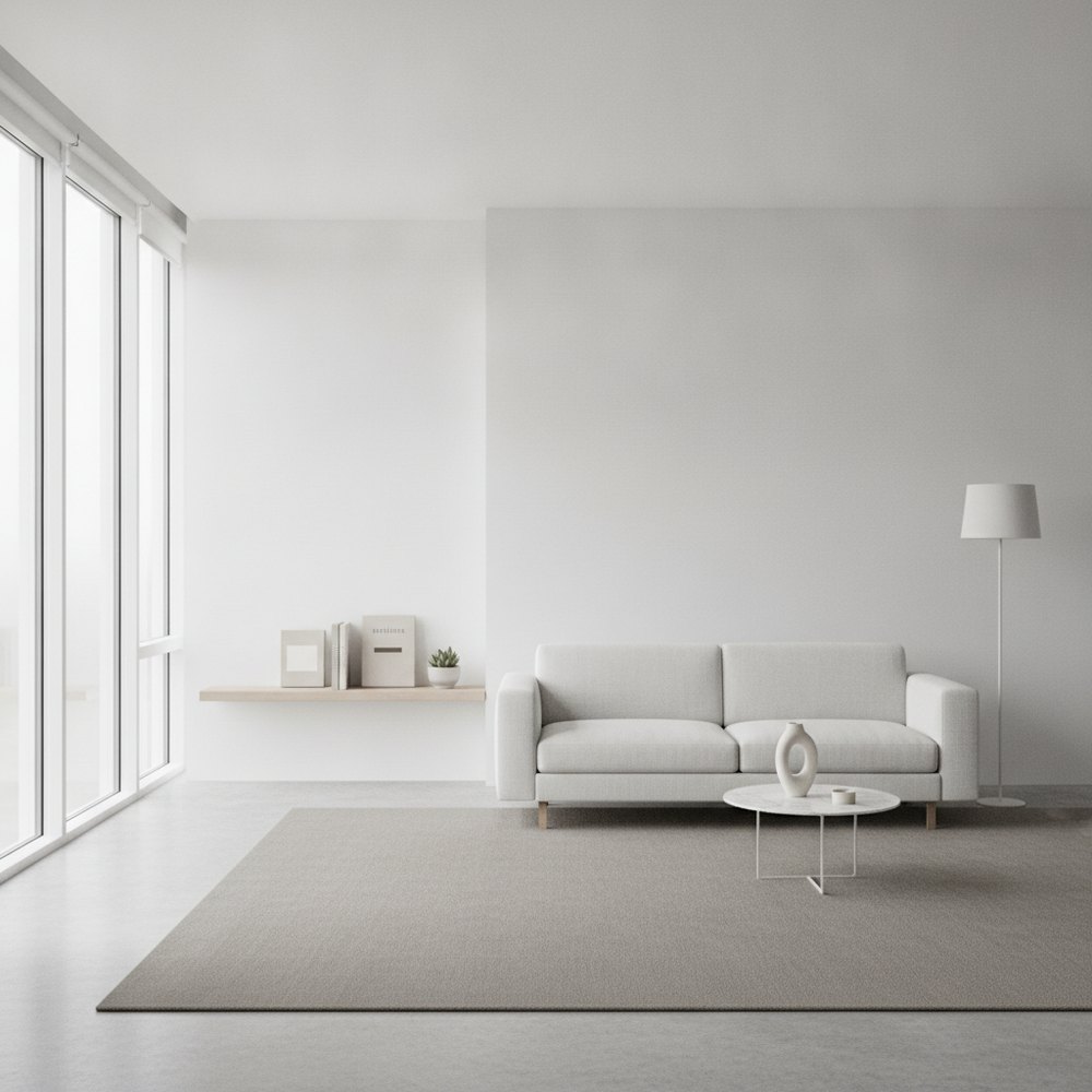
Texture is the quality of a surface, how it looks and feels, and layering is the deliberate mixing of several of them in one room. A flat room usually has only one or two textures repeated everywhere. Add rough against smooth, matt against sheen, soft against hard, and the room comes alive without a single new colour.
Why does a room feel flat even when the colours are right?
Nearly every flat room we walk into has the same problem, and it is almost never the colour. The paint is fine. The furniture is fine. It just sits there, like a showroom nobody has moved into yet.
What is missing is texture. When every surface is smooth, silk-finish walls, a flat-weave rug, a leather sofa, glass tables, the light hits everything the same way and bounces off with nothing to catch on. The eye has nowhere to rest and nothing to explore. It reads as a photograph of a room rather than a room. Colour tells you the mood; texture tells you it is real.
What is the difference between texture and layering?
Worth pinning down, because people use the words interchangeably and they are not the same thing.
Texture is a property of a single surface, the nub of a bouclé, the slub of a linen, the open grain of oak, the cool matt of plaster. Layering is what you do with several textures together: setting them side by side so they play off one another. One good texture is a nice cushion. Layering is the cushion on the chunky-knit throw on the leather chair on the wool rug, each surface doing something the others cannot. You need both. A single luxurious texture in an otherwise smooth room still looks lonely.
The materials that do the heavy lifting
You do not need forty different fabrics. In our experience a room reads as rich and considered with about five or six textures working together, drawn from across the tactile spectrum. These are the ones that earn their keep.
- Bouclé the looped, sheep-ish weave everyone reached for around 2020, and for good reason, it catches shadow beautifully. Use it on a chair or headboard, not the whole suite, or the room starts to look like a marshmallow.
- Linen the workhorse. Crumpled, matt, faintly imperfect, it stops a smart room from looking stiff. On curtains and cushions it softens hard lines instantly.
- Wool chunky knits, felted throws, a hand-tufted rug. Wool is where the cosiness lives, and it reads as warmth even before you touch it.
- Wood ideally with visible grain and a bit of age. A waxed oak table or a walnut sideboard brings depth that a painted lookalike never manages.
- Stone and plaster travertine, honed marble, a limewashed wall. The cool, hard, matt end of the scale that gives the soft stuff something to lean against.
- Rattan, jute and cane the rough, structural naturals. A jute rug or a caned cabinet front adds coarse texture cheaply, which matters when the bouclé chair did not.
How texture does the work colour can't
Here is the bit worth understanding, because it changes how you shop. Colour and texture are not two versions of the same tool.
Colour changes the mood of a room and it changes it loudly, you cannot miss a teal wall. Texture works quietly and does something colour simply cannot: it creates depth. A cream room with ten shades of cream but no texture variation is flat. A cream room with bouclé, linen, oak, jute and plaster, all roughly the same colour, has enormous depth and reads as expensive. That is the whole secret of the tonal neutral scheme, and it is why the best of them cost a fortune and the worst look like a dust sheet.
How do you layer texture in an all-neutral scheme?
Neutral rooms are where texture stops being optional and becomes the entire point. Take the colour out and texture is the only thing left doing any work, so it has to carry the room single-handed.
The method we use is to keep the colour palette tight, three or four warm neutrals at most, and then push the textures as far apart as they will go. Rough beside smooth. Matt beside a little sheen. Something you want to touch next to something cool and hard. A boxy linen sofa, a nubbly wool cushion, a glossy ceramic lamp, a raw-edged oak table, a deep-pile rug. Same colour story, wildly different surfaces. It is the approach that makes minimalist and Japandi schemes feel warm rather than austere.
Where contrast earns its place
Layering is not only about softness stacked on softness. The rooms that really land use contrast deliberately, pairing opposites so each makes the other look better.
- Rough against smooth a raw jute rug under a polished console; the coarseness makes the sheen look richer.
- Matt against gloss limewashed walls behind a glazed ceramic lamp, or flat linen against a glass tabletop.
- Hard against soft a marble hearth with a shaggy sheepskin thrown over the stone, cold and warm in one glance.
- Fine against chunky a crisp cotton sheet layered under a heavy waffle blanket and a cable-knit throw.
- Man-made against natural a sleek steel-framed chair softened by an aged leather seat and a wool cushion.
The mistakes that flatten a room again
It is easy to buy a lot of nice things and still end up flat, because layering can be undone by a few habits. These are the ones we see most.
- Matching everything a suite where sofa, cushions and curtains are the same fabric is a texture desert. Break the set up.
- One texture on repeat all velvet, or all high-gloss, reads as flat as no texture at all. Vary the surface, not just the shade.
- Forgetting the hard stuff people layer soft textiles endlessly and skip stone, wood and glass, so the room has no backbone.
- Skipping the floor and walls a plush rug and a limewashed or panelled wall do more than any number of cushions.
- Too many patterns instead of texture pattern is not a substitute; a busy room can still feel flat if every surface is smooth.
How can you test a textured scheme before you buy it?
Texture is genuinely hard to picture from swatches on a table, because the magic is in how the surfaces sit together in a real room under your real light. Ordering a bouclé chair to find it fights the rest of the room is an expensive way to learn that.
With Decorly you upload a photo of your actual room and see it restyled with layered materials, wood, wool, linen, stone, in seconds, keeping your true light and layout. It is a quick way to test whether a tonal neutral scheme or a bolder contrast reads well in your space before you commit to the furniture. For the schemes texture flatters most, our guides to modern organic interior design and wabi-sabi go further.
Frequently asked questions
Why does my room feel flat and boring?
Almost always because it lacks texture variation, not colour. When every surface is smooth, the room reflects light evenly and has no depth. Mix rough with smooth, matt with sheen and soft with hard, and the space gains life without changing a single colour.
How many textures should a room have?
Around five or six working together is usually enough to read as rich without looking chaotic. Aim to cover the tactile range: something soft (wool, linen), something hard (stone, wood, glass), something coarse (jute, rattan) and something with a little sheen.
How do you add texture to a neutral room?
Keep the colours tight, three or four warm neutrals, and push the textures far apart. Pair a linen sofa with a nubbly wool cushion, a glossy lamp, a raw oak table and a deep-pile rug. Same colour story, wildly different surfaces, which is what gives neutral rooms depth.
What is tonal texture?
Tonal texture is layering many different surfaces that share roughly the same colour, so all the interest comes from how they feel rather than contrasting shades. It is the technique behind expensive-looking neutral rooms, where bouclé, linen, oak and plaster all sit in one soft palette.
Is texture more important than colour?
They do different jobs. Colour sets the mood loudly; texture creates depth quietly. A room needs both, but texture is the one people forget, which is why a perfectly coloured room can still feel lifeless. If a scheme looks flat, add texture before you repaint.