Guides
How to Mix Colours in a Room That Work Together
July 12, 2026 · 9 min read
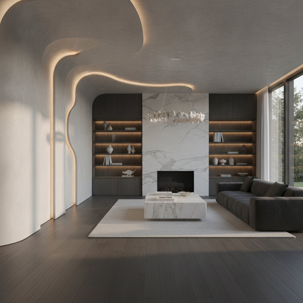
To mix colours in a room, use the 60-30-10 rule, roughly 60% dominant colour, 30% secondary and 10% accent, and keep undertones consistent. Pick a palette from the colour wheel using proven relationships such as complementary or analogous, balance warm and cool tones, and repeat each colour in at least two places.
Why does mixing colours well matter?
Colour is the single most powerful tool in a room. It sets the mood, defines the style and determines whether a space feels calm or energising, cohesive or chaotic, before you have registered a single piece of furniture.
The reason some rooms feel effortlessly pulled together while others feel off is rarely the individual colours, it is how they are combined and balanced. A little practical colour theory removes the guesswork, so you can mix colours with confidence rather than hoping they happen to work.
What is the 60-30-10 rule?
The 60-30-10 rule is the most useful shortcut in interior colour. It gives you a simple ratio for balancing a scheme so no colour overwhelms and the room feels harmonious and intentional.
- 60% dominant colour the base of the room, usually walls, large rugs and big furniture; often a neutral.
- 30% secondary colour roughly half as much, on upholstery, curtains, bedding or an accent chair.
- 10% accent colour the pop, in cushions, art, lamps and accessories, that brings the scheme to life.
- Why it works the proportions create a clear hierarchy, so the eye knows where to rest and what to notice.
- In practice the accent is the easiest to change, so evolve a room by swapping the 10% rather than repainting.
How do you use the colour wheel?
The colour wheel maps how colours relate to one another, and a few classic relationships reliably produce pleasing schemes. You do not need to memorise theory, just pick the relationship that matches the mood you want.
- Complementary opposite colours (blue and orange) for high energy and bold contrast; use one as the accent.
- Analogous neighbours on the wheel (blue, teal, green) for a calm, harmonious, easy-on-the-eye scheme.
- Monochromatic one colour in varying tints and shades for a sophisticated, restful, layered look.
- Triadic three evenly spaced colours for a lively, balanced palette; keep two muted and one bright.
- Split-complementary a softer take on complementary that gives contrast with less tension.
What is the difference between warm and cool colours?
Every colour sits somewhere on a warm-to-cool spectrum, and this affects both mood and how a room feels physically. Warm colours, reds, oranges, yellows and warm neutrals, feel cosy, sociable and energising, and make large or cold rooms feel more intimate.
Cool colours, blues, greens and greys, feel calm, spacious and restful, and can make small or busy rooms feel more open. A well-balanced room usually needs both: a mostly cool scheme warmed by a few warm accents, or a warm room grounded by something cool, so it feels neither clinical nor overheated. Match this to the room's purpose, cool for a restful bedroom, warm for a sociable living room, using our wall colour psychology guide.
Why do undertones make or break a scheme?
Undertones are the subtle secondary colours hiding within a shade, the pink, yellow, green or blue lurking in a grey, white or beige. They are the most common reason a scheme feels subtly wrong even when the main colours seem right.
Two greys can clash badly if one has a blue undertone and the other a green one; two whites can fight if one is warm and one is cool. The fix is to check undertones deliberately: compare samples side by side, and keep undertones consistent, warm with warm, cool with cool, across walls, flooring and furniture. Getting undertones aligned is what makes a neutral scheme feel expensive rather than muddy.
How do you build a palette step by step?
Rather than picking colours at random, build a palette in a logical order so every choice supports the last. This sequence keeps a scheme coherent from the start.
- 1Start with a fixed anchor a colour you cannot easily change, flooring, a large rug, a sofa or a key artwork.
- 2Choose your dominant 60% usually a neutral or soft base that flatters the anchor and suits the room's light.
- 3Add a secondary 30% a colour that relates to the dominant via the wheel and sets the room's character.
- 4Pick an accent 10% a livelier colour for energy, easy to repeat in small, swappable pieces.
- 5Check undertones and warmth confirm the whole palette leans consistently warm or cool before buying.
- 6Test in the actual room view large samples in daylight and at night, as light transforms every colour.
How do you avoid colours clashing?
Most clashes come from a few avoidable habits rather than genuinely incompatible colours. Keep these guardrails in mind and a scheme stays harmonious.
- Repeat every colour use each colour in at least two or three places so nothing looks stranded.
- Limit the palette three to four colours plus neutrals is plenty; more starts to feel chaotic.
- Match undertones the single biggest cause of subtle clashes, keep warm with warm and cool with cool.
- Balance saturation pair bold with muted rather than several fully saturated colours competing at once.
- Use neutrals as breathing space they separate stronger colours and stop a scheme feeling busy.
- Anchor with the 60-30-10 ratio clear proportions prevent any one colour from overwhelming the rest.
How can you test a colour scheme before committing?
Colour is notoriously hard to judge in the abstract, samples lie, and light changes everything, so mistakes with paint and furniture get expensive fast. Seeing a whole scheme on your actual room is the surest way to get it right.
With Decorly you upload a photo of your room and generate versions in different palettes in seconds, testing dominant colours, secondary tones and accents together on your real space while keeping its true proportions. You can compare a warm, analogous scheme against a cool, complementary one before buying a single tin of paint. For the shades trending now, see our best paint colours 2026 guide.
Frequently asked questions
What is the 60-30-10 rule in interior design?
It is a ratio for balancing a colour scheme: about 60% dominant colour (walls and large furniture), 30% secondary colour (upholstery, curtains, bedding) and 10% accent colour (cushions, art, accessories). The proportions create a clear hierarchy so the room feels harmonious rather than chaotic.
How many colours should you use in a room?
Three to four colours plus neutrals is a reliable guide. That is typically a dominant, a secondary and one or two accents, enough for interest and depth without the scheme becoming busy. Repeat each colour in at least two places so nothing looks stranded.
What are undertones and why do they matter?
Undertones are the subtle secondary colours within a shade, such as the pink, yellow, green or blue hiding in a grey, white or beige. They are the most common cause of a scheme feeling subtly wrong. Keep undertones consistent, warm with warm and cool with cool, across walls, floors and furniture.
How do I know if colours will clash?
Clashes usually come from mismatched undertones, too many saturated colours competing, or a colour used only once. Match undertones, limit the palette to three or four colours plus neutrals, balance bold with muted, and repeat each colour so the scheme reads as intentional.
Can I test a colour scheme before painting?
Yes. Decorly redesigns a photo of your real room in different palettes in seconds, so you can compare dominant colours, secondary tones and accents together on your actual space before buying paint or furniture.