Guides
The Best Paint Colours for 2026, Room by Room
July 12, 2026 · 9 min read
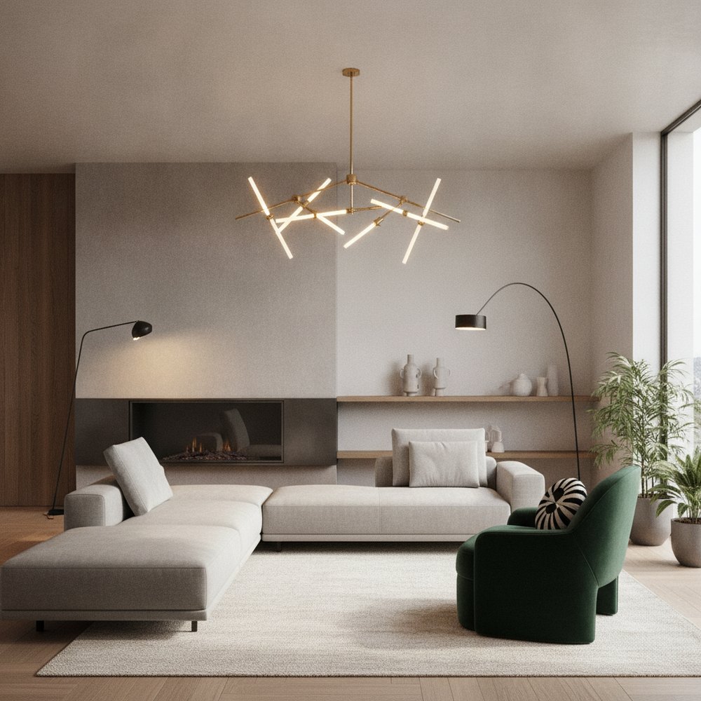
The best paint colours for 2026 move away from cool grey towards warmth and nature: soft warm neutrals, earthy browns and terracottas, muted greens, moody blues and greens, and creamy off-whites. Choose by room, light and mood, and always test a shade on your own wall before you commit.
What are the biggest paint colour trends for 2026?
The defining shift for 2026 is warmth. After years of cool greys and stark brilliant whites, interiors are turning towards colours that feel grounded, natural and comforting, drawn from soil, clay, foliage and stone.
In practice that means four broad directions dominate: warm neutrals as the new backdrop, earthy browns and terracottas for cosseiness, muted and moody greens and blues for depth, and softer creamy whites in place of clinical bright white. The common thread is that every one of them leans warm and organic rather than cold.
Why are warm neutrals replacing grey?
Grey defined the 2010s, but it can read cold and slightly corporate, especially in rooms with limited natural light. Warm neutrals, greige, oatmeal, clay, mushroom and soft taupe, give you the same calm, versatile backdrop while feeling far more inviting.
They also flatter natural materials beautifully, which matters as wood, linen, rattan and stone continue to dominate. If your instinct is a safe, liveable colour that will not date quickly, a warm neutral is the strongest choice for 2026, and it pairs naturally with a Scandinavian or minimalist scheme.
Which earthy and moody tones are on-trend?
Beyond neutrals, 2026 embraces richer, nature-derived colour for rooms that can carry more depth. These shades add character and cocoon a space rather than open it up, so they suit rooms you want to feel intimate.
- Terracotta and warm clay earthy, sun-baked tones that add warmth without feeling loud.
- Soft browns and mushroom chocolate, coffee and taupe browns are back as sophisticated, grounding colours.
- Muted sage and olive green calming, nature-linked greens that work as neutrals in their own right.
- Deep forest and teal moody, enveloping colours for feature walls, studies and dining rooms.
- Dusky blues and slate softer than navy, characterful yet restful for bedrooms and hallways.
What are the best white and off-white paints for 2026?
White is not going anywhere, but the flavour has changed. Cool, blue-based brilliant whites feel dated and clinical, so 2026 favours warmer, creamier whites with a hint of yellow, cream or grey to soften the light.
As a rule, choose a white with a warm undertone for cosy, north-facing or period rooms, and keep crisper whites for contemporary spaces with strong light. Painting walls, ceiling and trim in gently different tones of the same warm white is a quietly luxurious look for 2026.
Which paint colours suit each room?
Colour should follow the function and light of a room, not just the trend list. Here is where each 2026 direction tends to perform best.
- Living room warm neutrals or a muted green for calm; a moody accent wall for evening drama.
- Bedroom soft earthy tones, dusky blue or warm off-white for a restful, cocooning feel.
- Kitchen creamy whites, sage or clay on cabinetry, with a warm neutral on the walls.
- Home office a deep, moody green or blue to aid focus, balanced by plenty of light.
- Hallway and entrance a warm neutral or characterful earthy tone to set a welcoming tone.
- Bathroom soft greens, warm whites or dusky blue for a spa-like, natural mood.
How do you choose the right paint colour?
The single biggest mistake is choosing a colour from a tiny chart under shop lighting. A colour is not a fixed thing; it shifts dramatically with the light, the room's aspect and the surfaces around it.
Work through a short checklist before you buy: consider how much and what kind of light the room gets, the mood you want, the fixed elements you cannot change, and how the colour connects to adjoining rooms. Our guides on wall colour psychology and how to mix colours go deeper on getting a scheme to hang together.
- Start with light north-facing rooms suit warm tones; bright south-facing rooms can take cooler ones.
- Decide the mood calming and restful, or energising and dramatic, then let that narrow the palette.
- Match fixed elements flooring, worktops and large furniture you are keeping should guide the choice.
- Check the undertone hold candidates side by side to spot hidden pink, green or blue casts.
- Think about flow adjoining rooms should relate, not clash, when doors are open.
How do you test a paint colour on your own wall before buying?
Because colour changes so much with light and context, testing on your actual wall is non-negotiable. The traditional method is to paint large sample patches, but there is now a far faster first step.
With Decorly you upload a photo of your real room and instantly see it repainted in different 2026 shades, keeping your true light, layout and furniture. You can compare a warm neutral against a moody green in seconds, shortlist your favourites, then buy physical tester pots only for the two or three you love, painting large A3-sized patches and viewing them morning, noon and night before committing.
What are common paint colour mistakes to avoid?
Most paint regrets come from a handful of predictable errors. Sidestep these and you will get a far better result from any colour you choose.
- Choosing from a small chart always test large samples on the actual wall in real light.
- Ignoring undertones a beige with a pink cast can ruin an otherwise good scheme.
- Defaulting to cool grey or bright white both can feel cold and dated for 2026.
- Forgetting the ceiling and trim a slightly warm white overhead lifts the whole room.
- Painting before testing on your wall preview digitally first, then confirm with tester pots.
Frequently asked questions
What are the best paint colours for 2026?
The strongest directions are warm neutrals like greige and clay, earthy browns and terracottas, muted greens such as sage and olive, moody blues and forest greens for depth, and creamy warm whites in place of cool brilliant white. All lean warm and nature-inspired.
Is grey still in style in 2026?
Cool grey is fading as the default backdrop because it can feel cold and clinical. Warm neutrals, greige, taupe, mushroom and clay, are replacing it, offering the same versatility with far more warmth. Grey still works when it has a warm or greenish undertone.
What is the best white paint colour for 2026?
Warm, creamy whites with a hint of yellow, cream or soft grey suit 2026 best, as cool blue-based brilliant whites feel dated. Choose a warmer white for north-facing or period rooms and a crisper one for bright, contemporary spaces.
How do I test a paint colour before buying?
Preview shades digitally on a photo of your room using an AI tool like Decorly to shortlist quickly, then paint large A3-sized tester patches of your top two or three on the actual wall. View them in morning, midday and evening light before deciding.
Which paint colour is best for a small or dark room?
A warm neutral or soft off-white keeps a small or dark room feeling open, while a warm undertone stops it feeling cold. Alternatively, embrace the darkness with a moody, cocooning colour, which can make a small room feel intimate rather than cramped.