
Rooms
Kitchen Backsplash Ideas That Change the Whole Room
August 13, 2026 · 8 min read
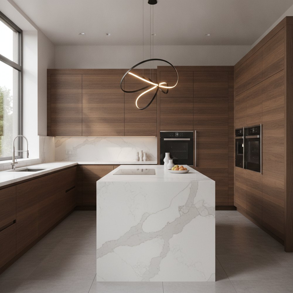
A splashback is typically two to four square metres, which makes it the cheapest surface in a kitchen to change and the one with the highest visual return. The safest high-impact choice is a plain tile in an interesting texture or format, run full height from worktop to wall units with matching grout.
Why the splashback punches above its size
It sits at eye level, directly in the sightline when you stand at the worktop, and it is framed on all sides by cabinetry, which draws attention to it the way a mount draws attention to a picture.
It is also the one kitchen surface where a bold decision is genuinely low-risk. Changing your cabinet doors is a project. Changing a two-square-metre splashback is a weekend and a few hundred pounds, and it can transform how a kitchen reads.
That combination, high visibility and low cost, is why it is the first thing to change in a kitchen you are stuck with.
The main options and what they cost you
Roughly ordered from cheapest to most expensive.
- Painted wall with a small upstand. The budget option. Works if the wall is sound and you use a wipeable finish, but it will need repainting behind the hob.
- Ceramic tile. The workhorse. Enormous range, easy to fit, easy to replace. Handmade or textured tiles cost more and look considerably more expensive than flat printed ones.
- Porcelain slab. A single large piece with no grout lines. Modern, seamless, easy to wipe, and the most expensive tiled option.
- Stone or quartz, matching the worktop. Running the worktop material up the wall is the quiet luxury move. It reads as expensive because it is, and it makes a kitchen look bespoke.
- Toughened glass. Seamless and easy to clean, but the colour is applied behind and it can look flat. Best in a single deep colour rather than a pale one.
- Stainless steel. Practical behind a hob, professional in feel, and a specific look you either want or do not.
How high should a splashback go?
Full height, worktop to the underside of the wall units, is almost always the better answer and is what makes a splashback look designed rather than functional.
The alternative, a 100 to 150mm upstand with painted wall above, is cheaper and reads as a builder's default. It also means the paint behind the hob and the kettle takes the damage.
Where there are no wall units, run the splashback to a logical line: the same height as the neighbouring wall units, the top of a window reveal, or full height to the ceiling if the wall is a feature. Stopping at an arbitrary height with nothing to justify it looks unresolved.
One exception: behind a hob with an extractor, take the splashback the full height to the extractor regardless of what happens elsewhere.
Matching the splashback to your cabinets
The relationship between cabinet colour and splashback is where most kitchens succeed or fail, and there are three workable strategies.
Blend. A splashback close in tone to the cabinets makes the kitchen read as one calm volume. This is the right approach with a strong cabinet colour, deep green cabinets with a soft green or off-white splashback, because two loud elements fight.
Contrast. A splashback in a strongly different tone or material makes it the feature. This works when the cabinets are quiet: plain white or pale timber cabinets with a bold zellige or a dark stone splashback.
Continue. Running the worktop material up the wall removes the decision entirely and is the most expensive-looking of the three.
What rarely works is a busy patterned splashback with patterned or highly figured worktops, since both are competing for the same attention.
Tile formats worth considering
Beyond the standard metro, several formats read as more considered for similar money.
- Vertically stacked rectangles. The same metro tile turned 90 degrees and stacked. Draws the eye up, feels current, costs nothing extra.
- Zellige or handmade tiles. Irregular surfaces that catch light differently across the wall. Expensive per square metre but the area is small, and nothing else looks like it.
- Square tiles in a grid. Quietly modern, particularly in a mid tone with matching grout.
- Elongated thin tiles. 50 x 250mm formats, stacked or offset, which give strong linear rhythm.
- Large-format porcelain in a stone effect. Seamless, minimal grout, and reads as slab at a fraction of the cost.
The practical constraints
A few things that determine whether you will still like it in three years.
Cleanability first: anything behind a hob will be hit by oil, and a heavily textured or deeply grouted surface there is a maintenance decision. Some people use a wipeable slab behind the hob and a textured tile elsewhere.
Grout colour matters as much as it does in a bathroom. Matching grout keeps a splashback calm; dark grout with light tiles turns it into a graphic pattern, which may be what you want.
Check heat tolerance behind a gas hob, and check what your local regulations require for clearance. And if the wall is uneven, a large slab will show it far more than small tiles will.
Lighting the splashback
Under-cabinet lighting exists to light the worktop, but its side effect is that it grazes the splashback, which is why textured tiles look extraordinary in some kitchens and flat in others.
If you are choosing a handmade or textured tile, plan the under-cabinet lighting at the same time, because raking light across an irregular surface is precisely what makes it worth the money. Conversely, a very flat glossy splashback under a strip light will show every reflection of that strip.
Warm light, around 2700 to 3000K, and mounted at the front edge of the wall unit rather than the back, so it lights the worktop rather than only the wall.
See it against your cabinets
Splashback samples are particularly misleading, because the tile is only ever seen in relation to the cabinet and worktop colours around it.
With Decorly you can photograph your kitchen and test different splashback materials, formats and grout colours against your existing cabinets and worktop before buying a single box. For the wider kitchen, see AI kitchen design and modern kitchen remodeling.
Frequently asked questions
How high should a kitchen backsplash be?
Full height, from the worktop to the underside of the wall units. A short 100 to 150mm upstand with painted wall above reads as a builder's default and leaves the paint behind the hob and kettle to take the damage. Where there are no wall units, stop at a logical line.
What is the cheapest way to update a kitchen?
The splashback. It is typically two to four square metres, sits at eye level framed by cabinetry, and can be changed in a weekend. No other kitchen surface gives as much visual change for as little money.
Should the backsplash match the cabinets or contrast?
Blend if the cabinets are a strong colour, since two loud elements fight. Contrast if the cabinets are quiet, such as plain white or pale timber, and let the splashback be the feature. Running the worktop material up the wall removes the decision and looks the most expensive.
Are handmade tiles worth it for a splashback?
Often yes, because the area is small enough that the higher price per square metre stays manageable, and the irregular surface catches light in a way flat printed tiles cannot. Plan under-cabinet lighting alongside them, since raking light is what makes the texture worth paying for.