Guides
How to Style a Bookshelf Without Overdoing It
July 25, 2026 · 8 min read
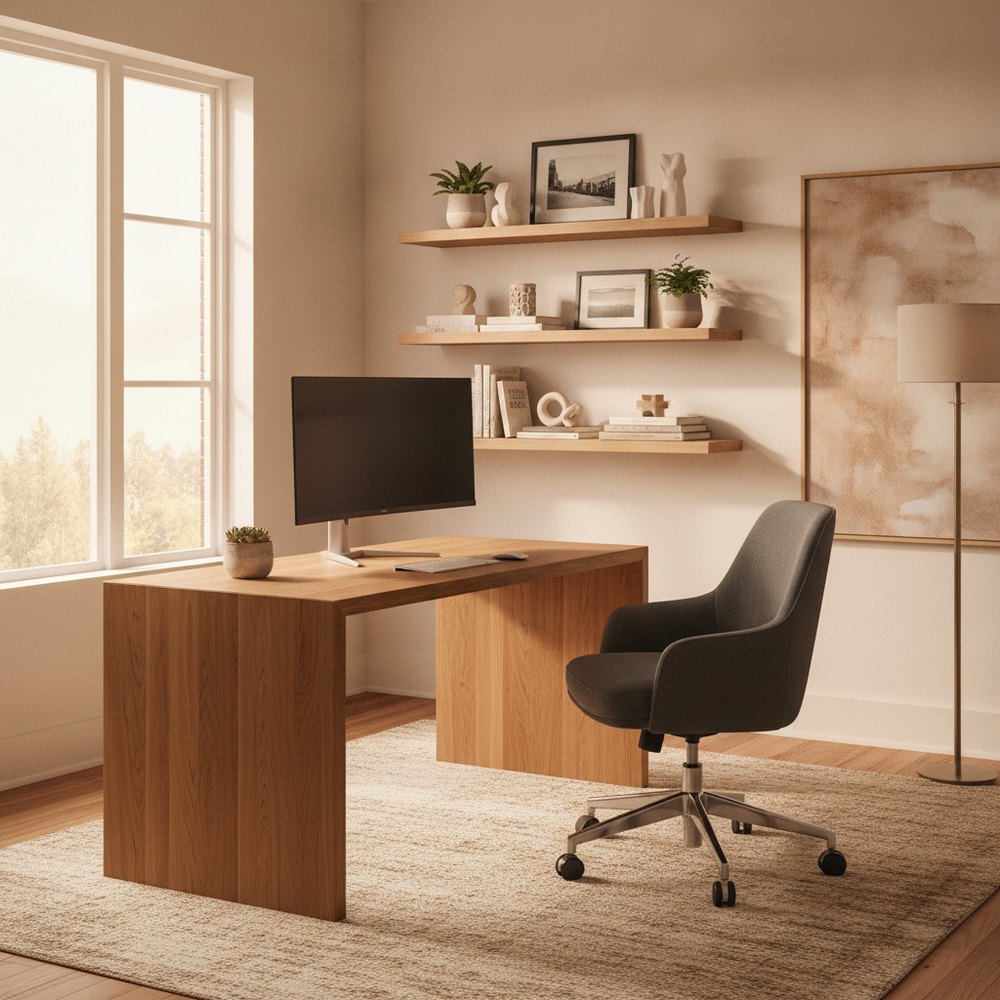
To style a bookshelf, mix upright books with a few horizontal stacks, break the rows with objects grouped in odd numbers, and leave genuine empty space so the eye can rest. The commonest mistake is cramming every shelf full. A styled shelf is half books, half breathing room.
Start by taking everything off
You cannot style a shelf you're editing around. Clear it completely, pile everything on the floor, and dust the thing while it's empty. Now you're composing rather than tidying, and that's the whole difference.
Sort the pile into three groups as you go: books worth showing, objects worth showing, and things that should honestly live somewhere else. Most people's shelves hold at least a third too much stuff. Be a bit brutal here; it's the single biggest lever you have and it costs nothing.
Books: vertical, horizontal, and why you need both
Books all standing to attention like a library shelf is fine for storage but flat as decoration. The move that makes a shelf look styled rather than shelved is mixing orientations: rows of upright spines interrupted by the occasional horizontal stack.
A short horizontal stack does two jobs. It breaks the vertical rhythm so the eye has somewhere to pause, and it doubles as a little plinth to raise an object, a ceramic, a small sculpture, a candle, off the shelf and give it presence. Keep stacks low, three to five books, and vary where they land across the shelves so they don't line up into an accidental column.
- Group upright books in runs of varied heights rather than sorting them tallest to shortest like a staircase.
- Turn a few spines inward or wrap tatty paperbacks if you want a calmer, more tonal look, though don't do the whole shelf unless you never intend to find a book again.
- Consider loose colour grouping rather than a full rainbow; blocks of tonal colour read as calm, a strict rainbow can read as a bit try-hard.
Objects in odd numbers, and why three beats four
Objects almost always look better grouped in odd numbers, threes and fives, than in even ones. Even groupings pair up and feel static; odd groupings force a small asymmetry the eye finds more natural and more interesting. It's the oldest trick in styling and it genuinely works.
Build each little grouping with variation in height, a tall thing, a medium thing, a low thing, so it forms a loose triangle rather than a flat line. Mix materials and finishes too: something matte against something glazed, something organic like a bowl or a stone against something structured like a framed print. Vary texture and the shelf comes alive; repeat the same finish and it goes dead.
Negative space is the secret ingredient
The thing separating a designer's shelf from a jumble is empty space, and it's the hardest bit to accept because every gap feels like a job unfinished. It isn't. Negative space is what lets each object read as chosen rather than stored.
Aim, very roughly, for something like half the shelf given over to breathing room. Leave space above a group so it isn't jammed against the shelf overhead. Let one whole section carry just a single sculptural object with nothing around it. A shelf that's 70% full and calm will always look more expensive than one that's 100% full and busy, whatever the objects cost.
Depth, layering and the back of the shelf
Flat shelves where everything sits in a neat front row look like a shop display waiting to be bought. Depth is what gives a shelf that collected, lived-in quality, and it costs nothing to add.
Lean a framed print or a small piece of art against the back of the shelf and set a shorter object in front of it, slightly overlapping. That overlap is the whole trick: it tells the eye these things belong together and sit in real space. Pull a few pieces forward to the front edge and push others back. A shelf with a front layer and a back layer reads as considered; a single flat plane reads as a spreadsheet.
The over-styled trap
There's a failure mode at the opposite end from clutter, and it's just as common now: the shelf so styled it looks like a hotel lobby nobody's allowed to touch. Colour-coded books nobody reads, a decorative object on every plinth, a trailing plant on all five shelves, three identical brass candlesticks. It photographs well and lives badly.
The tell is that nothing on it is actually used. A shelf should hold a bit of your real life, the books you're mid-way through, a photograph that means something, the odd thing that has no design justification at all beyond that you like it. Aim for styled, not staged. If you couldn't grab a book off it without dismantling a composition, you've gone too far.
Working shelf by shelf: a quick order of operations
If a blank bookcase is intimidating, this sequence takes the paralysis out of it. Work one shelf at a time and stand back constantly.
- Anchor with the big pieces first a couple of larger books or a substantial object on each shelf, spread out, not all in a line.
- Add book runs upright groups of varied heights, with the odd horizontal stack.
- Layer in objects in odd-numbered groups, using stacks as plinths and leaning art at the back.
- Thread in one plant or something living on a shelf or two, trailing over an edge to soften the geometry.
- Then remove a third of it and see if the shelf looks better. It usually does.
Preview a styled shelf in your own room first
Styling is fiddly and it's genuinely hard to picture how a shelving scheme will sit in the room until it's done. Seeing the effect on your actual space before you buy a single object or bookend saves both money and Saturday afternoons.
With Decorly you upload a photo of your room and generate versions with the shelving styled, on your real wall and at your proportions, so you can judge how full is full enough, how much negative space feels right, and whether a calmer tonal look or a more collected one suits the space. It's a fast way to settle the balance before you commit. For the rest of the wall, our gallery wall ideas guide is a natural next read.
Frequently asked questions
How do you style a bookshelf like a designer?
Clear it fully, then compose. Mix upright books with a few low horizontal stacks, group objects in odd numbers with varied heights and finishes, layer art at the back with objects in front, and leave roughly half the shelf as negative space. The empty room is what makes it look considered.
Should books be arranged vertically or horizontally?
Both. Runs of upright spines give structure, and occasional low horizontal stacks break the rhythm and double as plinths to raise an object. Keep stacks to three to five books and scatter them across shelves so they don't line up into an accidental column.
Why do you style objects in odd numbers?
Odd-numbered groups, threes and fives, create a slight asymmetry the eye finds natural and interesting, whereas even groups pair up and feel static. Build each group with varied heights so it forms a loose triangle, and mix materials for contrast.
How full should a bookshelf be?
Less full than instinct says. Aim roughly for half books and objects, half breathing room. A shelf that's around 70% full and calm reads as more expensive than one crammed to 100%. Negative space is what lets each piece register as chosen rather than stored.
What is the over-styled bookshelf trap?
It's styling a shelf until it looks staged rather than lived-in: colour-coded unread books, an object on every plinth, matching candlesticks, nothing actually used. The fix is to include real life, a book you're reading, a meaningful photo, something you simply like, and to keep it grabbable.